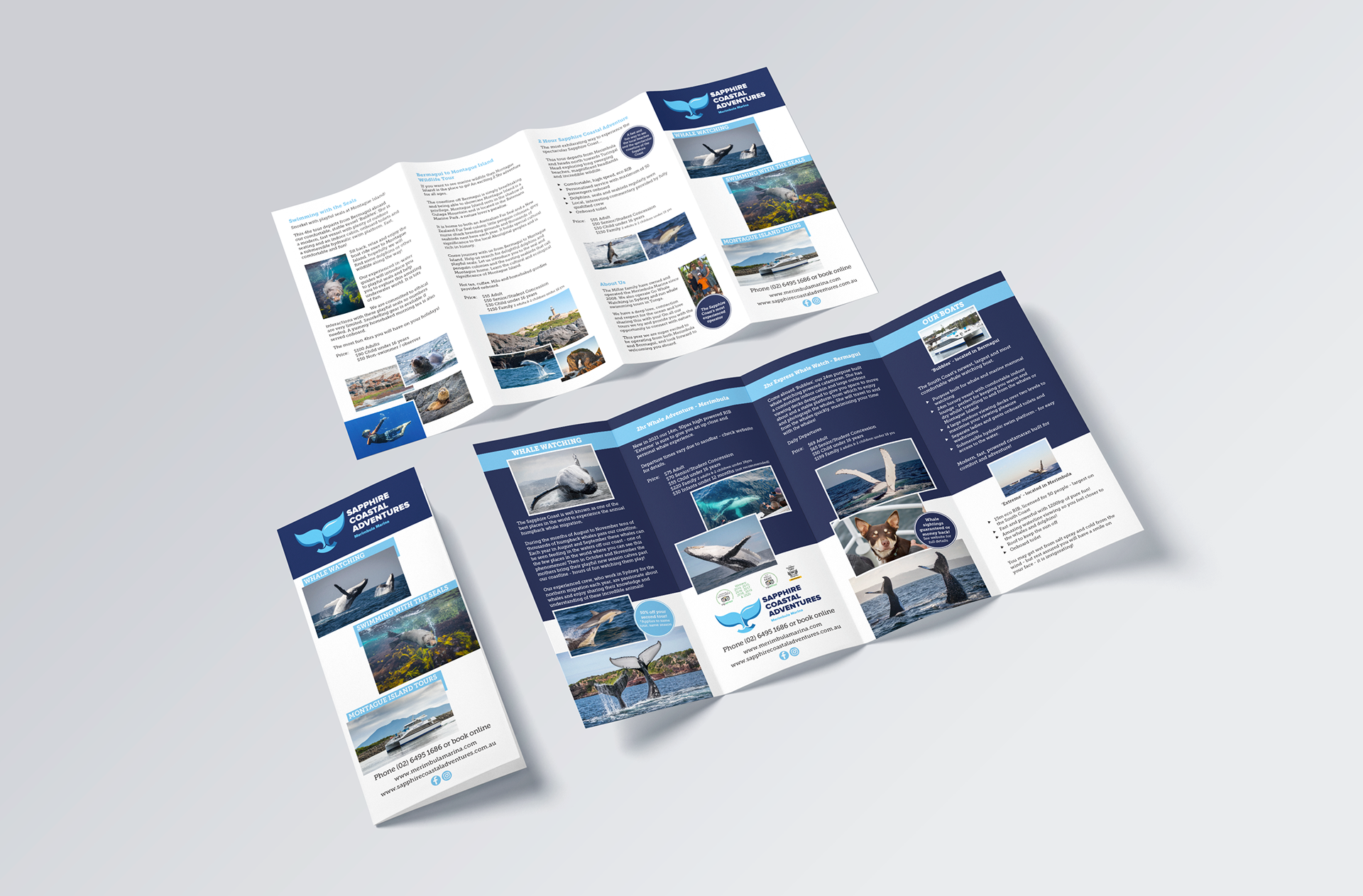
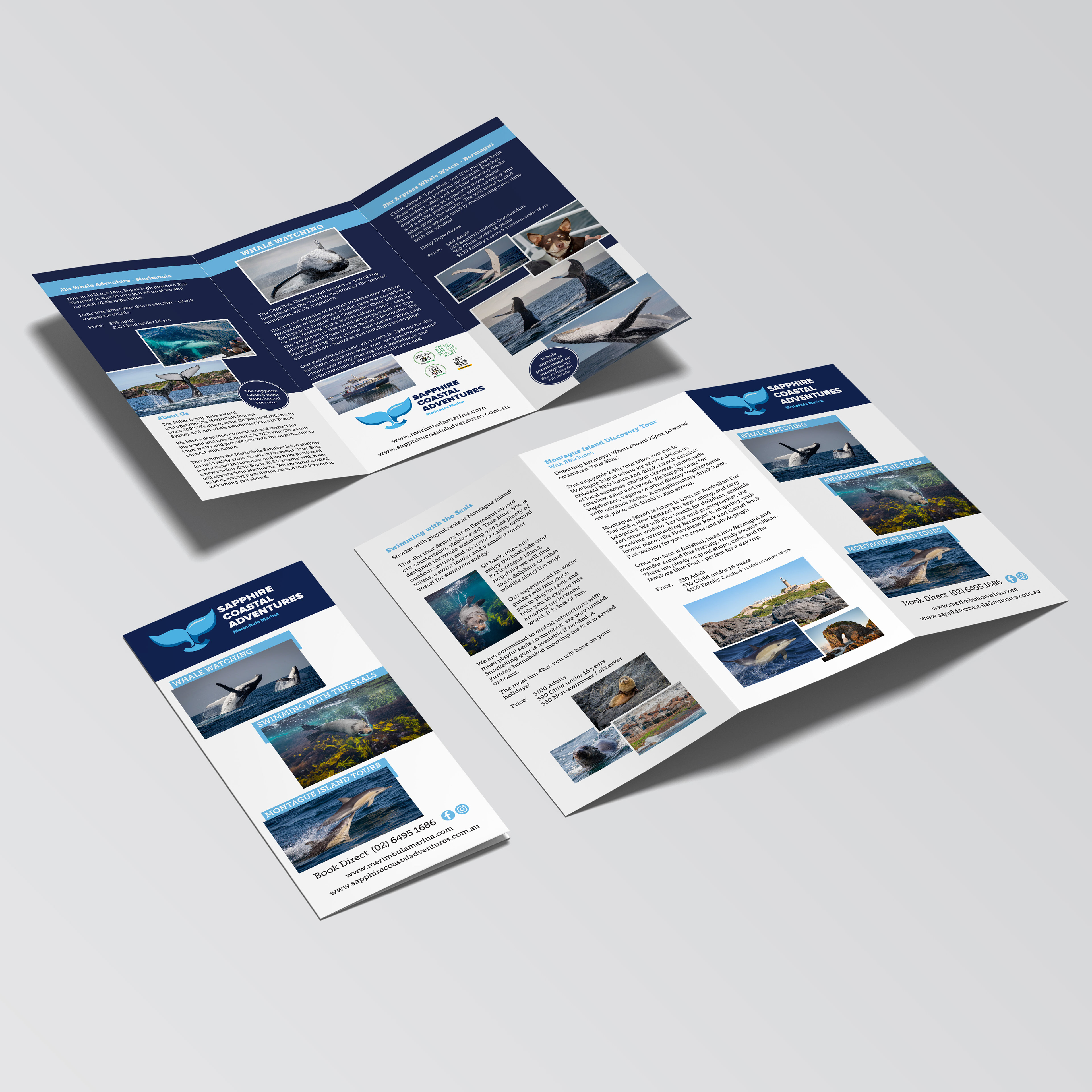
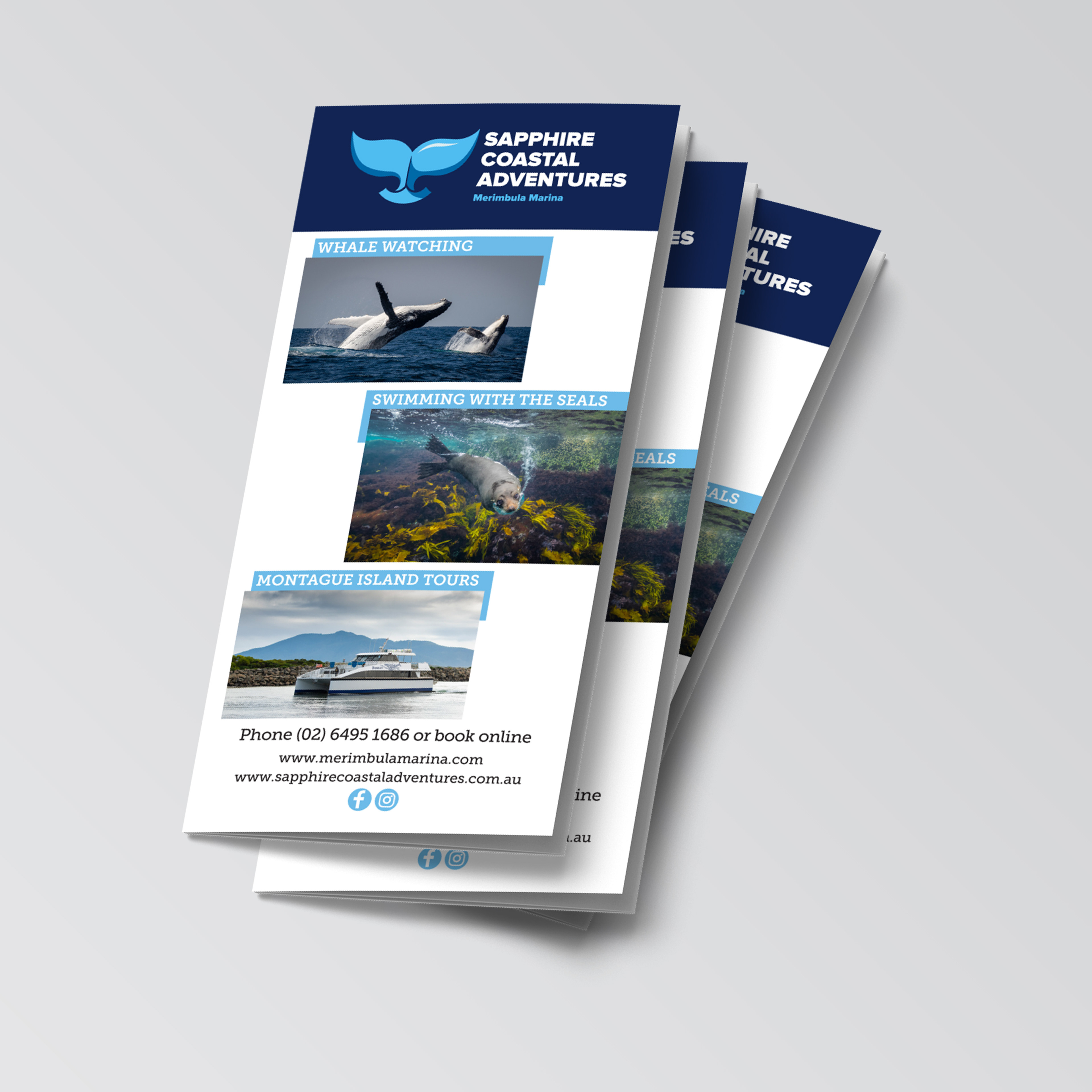
More projects

Sprout Eden – Layout | Website | Photography
My client, a local cafe, requested a flyer that emphasised their use of fresh, locally-sourced produce by showcasing their menu items. Additionally, they wanted to incorporate their unique story into the design, which was brought to life by the owner's daughter. The addition of a loyalty card encouraged return visits, while the online stores for their two cafés and wholefoods store – set up during the COVID-19 pandemic – allowed them to continue operations and reach their customers in new ways.
Eden Escapes – Layout
My client was looking for a cohesive set of printed marketing materials for their unique holiday rental. With branding already in place, the objective was to create visually appealing designs that effectively convey information about the property and the local area.
Project – Layout | Photography
This project was a four-page spread for a fictional magazine. The objective of the article was to communicate the cultural significance and allure of the iconic Anzac Biscuit. In addition to designing the layout, I also staged and photographed the biscuits for the feature.
Project – Logo Design | Corporate Identity
Corporate identity for a fictitious restaurant located in the Snowy Mountains. "The Bistro" is licensed and is open for breakfast, lunch, and dinner. With a modern, serif typeface, the logo aims to convey a sense of modernity and sophistication. The mountain graphic adds a visual element and symbolises the company’s location while avoiding the clichéd café or restaurant motifs.
Eden Chamber of Commerce – Layout
My client required a tri-fold brochure for their awards night program. The theme of the event was "Gala Masquerade Dinner". The design needed to incorporate elegant and sophisticated elements that captured the essence of the theme and showcased the prestige of the awards ceremony. The brochure included essential information about the event, such as award categories, sponsors, keynote speakers, and the menu.
Project – Icon Design
The objective for this project was to create a cohesive set of scalable icons. Each icon represents a room from the movie/game "Clue", with the use of similar shapes and consistent sizing providing unity across the set. What if the mansion really existed and was open to the public? With a subtle nod to the characters' colours, the icons are used in a promotional brochure guiding visitors through the fictional mansion.
Project – Logo Design
The objective for the "Copper Moose Vineyard" logo was to weave together the fictional winery's Canadian roots and its natural surroundings. The hand-drawn moose proudly stands above a curved shape, which evokes both the flow of wine and the meandering path of the winery's creek.
Back to Top